Every click on a CTA matters, as it can turn a visitor into an active user. Did you know that personalized CTAs can convert 202% better than generic ones, as they focus on guiding users toward complex on-chain actions. As Web3 use cases continue to grow, demand for conversion-driven UX design is increasing significantly.
CTA is more than a button or link; it guides the audience to meaningful action. In Saas, it might mean signing up or downloading a brochure, but in the crypto world, it involves transactions that require a leap of trust. They help reduce risk perception and create clarity in a high-stakes decision environment. A well-written CTA doesn’t just multiply conversions but builds confidence, communicates safely, and show users how to move forward on the platform.
What Is a Call to Action?
A Call to Action (CTA) is a clear prompt in digital marketing that encourages users to take a specific next step, like clicking a button, signing up, downloading, or exploring more content. CTAs act as directional cues that move users through your conversion funnel by reducing friction and clarifying the action you want them to take. Effective CTAs use concise, action-oriented language and are strategically placed to capture attention at key moments in the user’s journey.
Unlike traditional CTAs, crypto CTAs involve complex and high-trust actions that trigger on-chain transactions or interaction with decentralized infrastructure. This means CTAs can initiate actions such as Connect Wallet, Swap, Stake, Mint, Bridge, or Claim Rewards that require user confidence, security transparency, and technical clarity. As these actions involve real assets or digital ownership, crypto CTAs should be more transparent and trustworthy.
This difference makes CTAs important in the blockchain space, where users are guided through unfamiliar actions involving gas fees, wallets, smart contracts, and token transfers.
How Smart CTAs Improve Conversions and Adoption
In the skeptical crypto world, where risk and reward are equally high, a compelling CTA builds trust, turning a visitor into an active, on-chain user. Psychological principles like urgency, clarity, and perceived benefit play an important role in making them understand what they understand, what will happen, and why it’s in their interest. As crypto actions involve real-money decisions, users rely more on CTAs, making clear, value-driven messaging critical for adoption.
Smart CTAs also simplify the path to conversion. Analytics and conversion rate studies consistently show that optimized CTAs boost performance; for example, well-placed and prominent CTAs have been shown to increase conversion rates by up to 161%, and personalized CTAs convert 202% better than generic ones. Moreover, when CTA buttons are surrounded by less clutter and more white space, conversion rates can increase by 232% according to testing data.
A/B testing of CTAs demonstrates a 49% average conversion boost. This highlights the importance of a well-crafted CTA in the highly skeptical crypto space.
Types of CTAs: Formats and When to Use Them
Crypto websites use different CTA formats based on user intent, product complexity, and the point at which users interact with the interface. It’s important to note that choosing the right CTA format greatly influences conversions, especially when guiding users through actions that require trust or involve on-chain risk. The following CTAs are the most effective for crypto platforms.
Button CTAs for High-Intent Actions
Button CTAs are the most common and high-performing CTA type because they demand attention and guide users toward primary, high-intent actions. These high-performing CTA buttons are action-oriented and placed where intent is already high, such as near product descriptions, hero sections, or feature modules. Buttons like Sign Up, Trade Now, Connect Wallet, or Get Started stand out with high contrast in crypto platforms.
In the mobile environment, the design of these buttons is important; they should be tappable, prominent, and action-oriented, especially in pop-ups where value (e.g., Claim Your Discount or Swap Now) is required.
Text, Link & Micro-CTAs for Soft Conversions and Education
Text-based or inline CTAs support low-friction, low-commitment actions that help users learn and explore the ecosystem without pressure. These CTAs work best in places where users are still evaluating whether or not to trust you, like blog posts, onboarding guides, FAQs, or dashboards. These are the Learn More, Try it Now, or Read the Guide links that softly guide users toward the next steps without pressurizing them.
Micro-CTAs are effective in Web3 education flows where concepts like gas fees, bridging, staking rewards, or slippage require more explanation. Inline CTAs within paragraphs or email footers help users feel supported rather than rushed.
Banner, Pop-Up & Slide-In CTAs for Campaign Visibility and Urgency
These are highly visible CTAs, such as banners, pop-ups, and slide-ins, that draw user attention to time-sensitive campaigns like airdrops, new listings, staking windows, or trading competitions. These are considered the best-performing CTAs when triggered contextually, such as in exit-intent pop-ups, time-on-page triggers, or scroll-dependent slide-ins. This means serving banner for Mint Now, Join the Token Sale, or Earn Double Rewards Today.
It’s important to handle these formats carefully; overloading users with multiple pop-ups per session can backfire. Limit pop-up frequency and avoid interrupting the browsing flow to maintain a positive experience.
Form & Lead-Gen CTAs for Airdrops, Waitlists & KYC Signups
Lead-gen CTAs often take the form of embedded forms for airdrop registrations, waitlist signups, or KYC submissions. These forms are paired with persuasive CTAs like Join the Airdrop, Claim Early Access, or Verify Your Wallet to emphasize value and commitment.
This format captures user intent at relatively low risk, as users provide email or wallet info in exchange for potential future rewards. Align the form placement with the relevant context and use clear language to make these CTAs more attractive.
9 Examples of Call to Action Done Right
Effective CTAs combine clear wording, strategic placement, and audience-aligned intent. When applied to crypto platforms, this strategy helps users move through complex tools, high-risk decisions, and unfamiliar terminology. A well-placed CTA reduces user friction by offering clarity, lowering friction, or emphasizing value.
The section below includes examples of CTAs done right on nine crypto platforms.
1. Techtonic Marketing
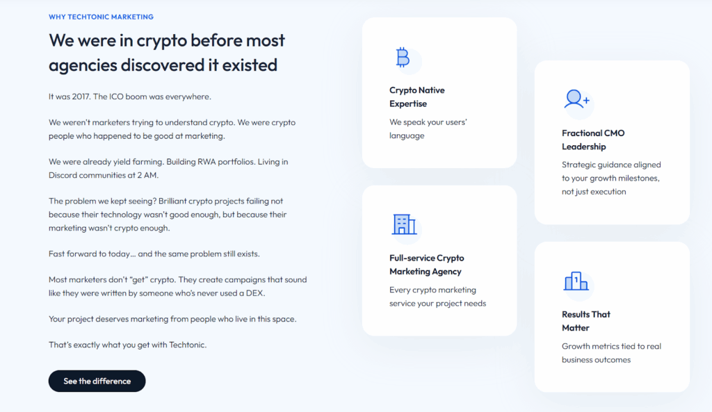
CTA: “See the Difference”
The CTA appears on Techtonic Marketing’s homepage, strategically placed after the section explaining the agency’s founding story and core philosophy. Clicking the CTA button takes you to the website’s contact us page.
Best For: The CTA is best for Web3 and blockchain project leaders who are in the evaluation stage of their decision-making process. Having understood the agency’s claims of holding crypto expertise and that their primary intent is to seek verification or tangible proof that the claimed difference translates into superior business results and high ROI compared to non-specialized competitors.
Why it’s Effective: The CTA taps into users’ need for trust and competence in the highly technical and skeptical crypto space. It also compels users to click through the case studies and results section, which are the highest-value conversion assets for high-stakes, B2B services like Web3 marketing.
2. CoinDesk

Newsletter CTA: “Sign me up”
The website has a high-value CTA, which appears on the Homepage and is placed in a dedicated module/sidebar on key article pages. The CTA requires users to enter their email address to continue.
Best For: This newsletter CTA is best for maximizing audience retention and building a direct communication channel. Capturing a visitor’s email address is the most effective way to transition a one-time reader into a dedicated user. It provides a reliable mechanism for delivering daily market updates, breaking news alerts, and curated analysis straight into users’ inboxes.
Why it’s Effective: The CTA uses active, enthusiastic, low-friction language that implies immediate action, reducing perceived effort compared to formal terms like “Subscribe Now” or “Register.”
3. Bitstamp
CTA: “Get Started”
The CTA is on the Bitstamp homepage. Its key locations include the main navigation bar (header) and directly below the main hero/banner section. Clicking the CTA button takes the user to the website’s registration page.
Best For: This CTA targets the user intent of a beginner who needs clear instructions to move from browsing to becoming a customer on a trusted exchange.
Why it’s Effective: The CTA is compelling because it’s low-friction, direct, and non-committal yet action-oriented. Moreover, its strategic, high-visibility placement throughout the homepage ensures that once a user signs up, they can immediately click to begin their conversion journey without needing to scroll or navigate.
4. Metamask.io

CTA: “Start Lesson”
The CTA appears at the bottom of the homepage, right above the footer, specifically under the section title “New to Web3?”. The link directs users to “MetaMask Learn,” a series of interactive lessons that explain what Web3 is, why it’s important, and how to use MetaMask.
Best For: This CTA targets individuals who have landed on the MetaMask website out of curiosity but lack the foundational knowledge to install or use a crypto wallet immediately.
Why it’s Effective: The CTA offers a structured, interactive educational resource while lowering the entry barrier, making the intimidating concept of a crypto wallet accessible.
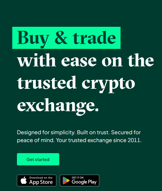
5. Blockchain.com
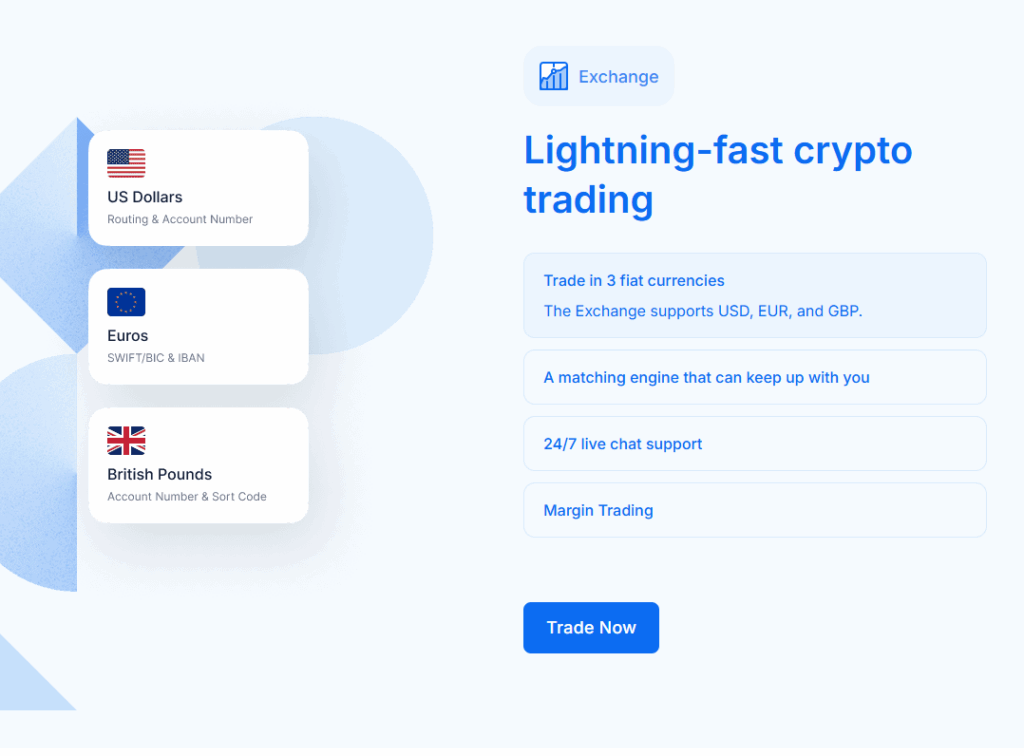
CTA: “Trade Now”
The CTA appears on the homepage, featured within the section promoting the Exchange product. Clicking the “Trade Now” button takes the user to the wallet sign-up page.
Best For: The CTA targets an intermediate-to-experienced audience actively seeking a transactional gateway to buy, sell, and trade crypto.
Why it’s Effective: The CTA is highly effective because its urgent, action-oriented language, combined with a sense of urgency (“Now”), drives immediate action.
6. Bitcoin.org
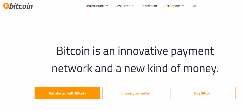
CTA: “ Get Started with Bitcoin” or “ Choose your wallet”
The website uses two effective approaches to address the primary needs of a diverse audience. The first CTA, “Get Started with Bitcoin,” takes users to a guide on using Bitcoin, and the second CTA, “Choose your Wallet,” takes users to a guide on finding a Bitcoin wallet.
Best For: “Get Started with Bitcoin” CTA is best for absolute beginners or curious newcomer users who need fundamental education and a guided path through the complexity of cryptocurrency. The “Choose your Wallet” CTA is tailored for more informed users who are ready for the first practical step toward ownership and is best suited for the consideration-to-action stage.
Why it’s Effective: These CTAs are effective because of their placement and wording, which cater directly to high-priority user intent simultaneously. The first CTA lowers the barrier to entry by promising a simple learning path, and the second CTA is a powerful high-intent action for users past the learning stage.
7. Ninja Promo
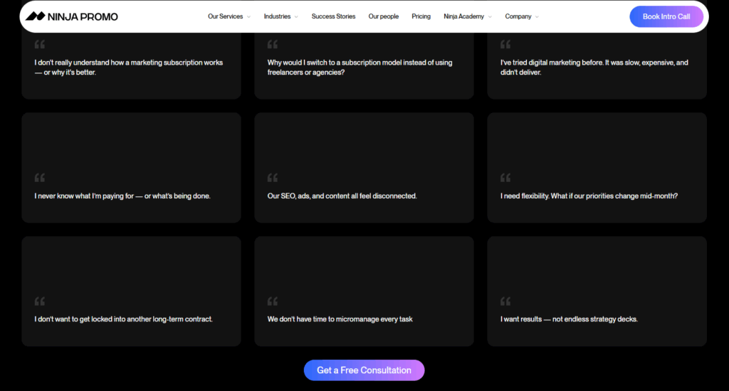
CTA: “Get a Free Consultation”
The CTA “Get a Free Consultation” appears on the NinjaPromo website’s homepage. It’s strategically placed after a section that anticipates and addresses common client objections and concerns. Clicking on the CTA button takes users to a contact form to connect with the website.
Best For: The CTA is best for high-intent, problem-aware business decision-makers who want to explore options to address complex marketing failures.
Why it’s Effective: The CTA lowers the entry barrier while promising personalized value. The word “free” removes the financial commitment required to take the consultation step. This helps build immediate trust among users.
8. TokenMinds
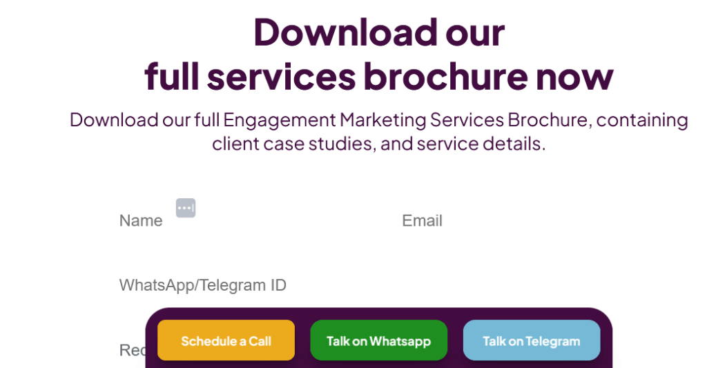
CTA: Sticky “Telegram, WhatsApp, Schedule a Call Button.
The CTA is visible on the homepage in sticky/floating buttons that stay visible across the site to maximize lead conversion opportunities. The “Schedule a Call” CTA takes users to a Calendly webpage for call booking, the “Talk on WhatsApp” CTA connects users directly with experts on WhatsApp, and the last CTA, “Talk on Telegram,” takes users to consult experts on the Telegram app.
Best For: The multi-channel approach is best for high-value, B2B clients who want customized agency solutions. The sticky placement and direct messaging links facilitate rapid lead generation and qualification for bespoke services.
Why it’s Effective: The CTA offers low-friction communication using channels familiar to the target audience.
9. Blockchain App Factory

CTA: “Talk to Our Experts”
The CTA is placed on the homepage right under the main header. Clicking the CTA takes the user to the website’s contact page.
Best For: The CTA is best suited for users who have moved past the initial research phase and have a solid Web3 project idea but need strategic guidance.
Why it’s Effective: The CTA directly delivers trust signals by using the word “Experts.”
Best Practices for Effective Calls to Action
Creating high-performing CTAs requires more than just choosing a button color or adding a persuasive phrase. It’s noted that effective CTAs combine clarity, relevance, timing, and psychological triggers, especially in the crypto space, where users are cautious or confused. A strong CTA increases user confidence, reduces friction, and drives desirable behavior like signing up, connecting a wallet, or initiating a trade.
The practices below outline how clarity, value, urgency, emotion, relevance, and data-driven optimization convert CTAs into something that actually converts. Moreover, applying them across the landing pages or product screens ensures the platform not only attracts attention but converts it into meaningful engagement.
Be Clear and Action-Oriented
Use clear and direct language so users can instantly understand what happens after their click. Short verbs like buy, start, join, claim, connect, or swap remove confusion and guide users to the next step with confidence. Note that crypto platforms benefit more from clarity because users are often unfamiliar with actions like minting, staking, or bridging so using unambiguous CTAs increases trust and accelerates onboarding.
Focus on User Benefit, Not Just Task
CTA becomes compelling when it delivers value, not just an action, like changing “Connect Wallet” to “Connect Wallet to Start Earning”, which highlights reward. It’s seen benefit-driven CTAs outperform task-based ones because they activate motivation instead of fulfilling an obligation.
Add Urgency or Scarcity When Appropriate
Using urgency and scarcity responsibly drives effective results. For example, CTAs like “Claim Before it’s Gone” or “Ends Today” increase immediate engagement. But note that urgency should be applied selectively, only as its overuse creates fatigue and distrust.
Use Power Words & Emotional Triggers
Using power terms like unlock, secure, instant, discover, or exclusive makes CTAs more persuasive by introducing emotional drivers.
Tailor CTAs to Funnel Stage (TOFU, MOFU, BOFU)
CTAs should reflect different users at different stages in their journey. For top-of-funnel (TOFU) users who are just exploring, using soft CTAs like “Learn More” or “Explore Features” is recommended. For the middle section (MOFU), CTAs like “Start Free Trial” or “Try Demo” work best. The Bottom-of-funnel (BOFU) users who are ready to commit require CTAs “Buy Now”or “Stake Tokens.”
Aligning CTAs to the funnel ensures you’re not asking too much too soon and that you’re giving users the right prompt at the right time.
A/B Test and Optimize for Performance
Even the best CTAs require testing to improve their performance. These may take small adjustments in wording, color, placement, or size to help in removing audience confusion and increase meaningful conversions.
Where and How to Place CTAs on Crypto Websites for Maximum Impact
Strategic placement of CTAs on a crypto website is just as important as the website’s message. Placing a primary CTA above the fold (the section users see without scrolling) ensures that the most critical action is immediately visible. This visibility matters because the top of the page receives most views, and giving users clear details about the next step early.
However, the placement shouldn’t be limited to the top, because when users scroll or engage more with content, a secondary CTA placed mid-scroll can capture their attention when they are better informed and ready to act. Meanwhile, placing the CTA at the bottom of the content, after explaining benefits, use cases, or product features, allows well-informed users to convert.
The pop-ups, floating bars, or exit-intent CTAs capture users’ attention when they’re about to leave or show signs of hesitation. This means offering a last-chance opportunity to “Join Waitlist,” or “Claim Airdrop” before the users are about to leave can drive conversion without being overly intrusive.
Final Thoughts
As Web3 involves real-time financial decisions, such as connecting to a wallet or initiating a swap, high-performing, clear CTAs help build user trust, engagement, and conversion. It’s important to note that, beyond the wording, its design and placement also help increase conversions, especially when users are thoroughly guided.
The most effective crypto CTAs meet users where they are, like high-intent buttons above the fold, educational prompts mid-scroll,and supportive exit-intent for hesitant visitors. Testing and changing these CTAs through A/B experiments on copy, color, timing, and format help you choose what the audience prefer.
Frequently Asked Questions
How are CTAs different in crypto vs. traditional marketing?
CTAs trigger on-chain actions like wallet connect, swap, and mint, not just page navigation. They need to build trust, reduce friction, and, when necessary, educate users about complex processes.
What CTA phrases work best for Web3 onboarding?
Benefit-oriented phrases that reduce fear work best. Examples include words like “Get Started for Free,” “Explore the App,” “Connect Wallet to View Your Portfolio,” and “Learn How to Earn.”
How many CTAs should a landing page have?
A landing page should have one primary CTA to avoid confusing visitors, though the same CTA can be repeated multiple times on a long page to reinforce the message.
What CTA should I use if users are afraid to commit real money?
Use soft CTAs that focus on education and risk-free exploration. Use CTAs like “Try the Demo,” “Learn More,” “Watch a Tutorial,” or “Join the Community” for building trust and familiarity before asking for a financial commitment.